Physical Address
304 North Cardinal St.
Dorchester Center, MA 02124
Physical Address
304 North Cardinal St.
Dorchester Center, MA 02124


A practical guide to crypto holder maps, wallet clusters, and token concentration risk.
A holder map in crypto is an on-chain ownership view that shows who holds a token and which wallets may be connected.
Traders use holder maps to pause before a fast token buy. A green chart can hide a tight supply cluster, a deployer-funded wallet group, or a few whales waiting for late buyers. A holder map will not make the decision for you, but it can show where the next questions should start.
A holder map in crypto is a visual or structured view of token holders. It helps you see who owns supply, how much they own, and whether important wallets may be connected.
Think of it as a supply map, not a price chart. The chart tells you what the market just did. The holder map asks who can still move the market if they sell.
The risk is easy to miss when the token looks exciting. A new coin can show a green candle, active chat, and a growing holder count while the real supply still sits with a few wallets. The map gives you a slower read before the market narrative does the talking.
Start with the contract, not the ticker. Holder maps are tied to a specific token contract, and copied names are common on busy chains. If the contract is wrong, the cleanest map in the world is just a polished mistake.
Use a holder map to answer three early questions:
Most holder maps focus on a token contract. They may show large wallets as bigger circles, top holders as a ranked list, or clusters as connected groups. Some tools add labels for exchanges, liquidity pools, burn addresses, deployer wallets, treasuries, or contracts.
That context is the useful part. A large holder can be a normal exchange wallet, a vesting contract, a liquidity pool, a team treasury, or a whale. Those are not the same risk.
A holder map is not a safety certificate. It is also not a crypto heatmap, market bubble chart, rich list, or support-and-resistance map. If you confuse those tools, you may run the wrong check and still feel informed. Crypto loves that little trap.
A crypto holder map works by turning token balances and wallet relationships into a layout you can scan. Larger holders stand out first, then links, labels, and historical changes tell you what deserves a closer look.
Bubblemaps explains the visual logic behind this style of map: significant holders appear as bubbles sized by supply share, with wallet relationships shown through connected groups. Its example is simple but useful: ten connected wallets with 2% each can read more like one 20% supply position than ten unrelated holders. Learn that visual grammar before jumping to the scary story.
Use this table as a first pass, not a verdict:
| Map Element | What To Check Before Trusting It |
|---|---|
| Large holder | Whether it is a whale, exchange, LP wallet, treasury, or contract. |
| Connected wallets | Whether the wallets share funding, transfers, or launch timing. |
| Same-color cluster | Whether the grouped wallets act like one holder or normal service flow. |
| Exchange label | Whether the wallet likely represents many users, not one seller. |
| LP wallet | Whether liquidity is locked, thin, removable, or tied to the deployer. |
| Burn address | Whether the supply is truly inaccessible or just shown as inactive. |
| Deployer wallet | Whether it funded top holders or still controls token settings. |
| Historical change | Whether top holders are accumulating, splitting, or moving toward exits. |
The table gives you a reading order. First identify what the map shows. Then open the wallet history, because the map view is a summary of deeper chain data.
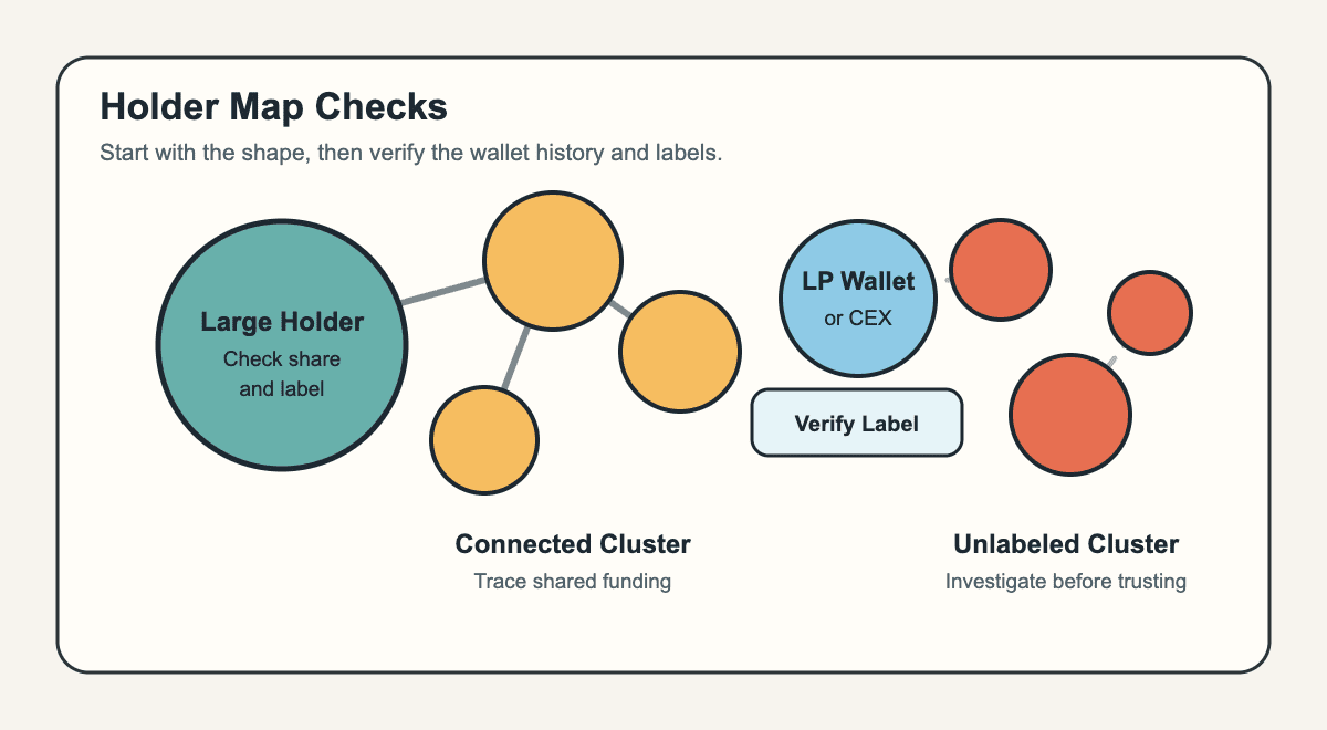
_A holder map helps you spot the shape of ownership before you verify the wallet history._
Labels deserve extra care. An LP wallet, exchange wallet, vesting contract, or burn address can sit near the top of a holder list without meaning one active trader controls that supply. An unlabeled wallet cluster can look smaller than it really is if one owner split supply across many addresses.
A holder map shows how token ownership is distributed, where supply is concentrated, and whether the biggest wallets deserve extra attention. It turns token holder distribution into something you can read before the crowd finishes chanting.
Concentration is not automatically bad. A new token may have team, treasury, market-making, or vesting wallets near the top. A large-cap token may have exchange wallets, custody wallets, bridges, wrapped-token contracts, and long-running treasury allocations.
The same visible pattern can mean different things:
| Ownership Pattern | Better Question To Ask |
|---|---|
| One large wallet | Is it active, labeled, locked, or tied to the deployer? |
| Several linked top wallets | Do they share funding or trade as one group? |
| Many tiny holders | Are balances meaningful, or were wallets dusted to inflate count? |
| Large LP or contract wallet | Can the tokens move, or are they part of normal market plumbing? |
| Treasury allocation | Is there a public vesting or spending explanation? |
The risk changes with token age, liquidity, disclosures, chain, and launch method. A 10% unlabeled wallet in a tiny memecoin can create more sell-pressure risk than a large labeled exchange wallet in a major asset.
The map helps you separate visible ownership from assumed ownership. Address count is not the same as independent holders. A token can show thousands of addresses while real control sits with a smaller group. That is why universal percentage thresholds break quickly across memecoins, DeFi tokens, exchange-listed assets, and vesting-heavy projects.
A holder map can prove visible balances and visible wallet links. It cannot prove who owns every wallet, what they plan to do next, or whether a token is safe to buy.
That distinction saves money. A bad holder map can be enough reason to pass on a trade. A clean holder map is only one passed check, not a permission slip.
Run the next checks before you trust the clean version:
Holder maps are strongest when they point to specific follow-up questions. They can show that wallets moved funds between each other, that a deployer funded buyers, or that top holders changed behavior after a pump. They cannot read intent.
The biggest blind spot is shared control. Insiders can split supply across fresh wallets, route through exchanges, delay transfers, or use wallets that never directly touch each other. That is where exit liquidity risk comes in: concentrated holders only need enough supply, liquidity, and new demand to sell into. Clean maps also age badly during fast launches, so check the live map and explorer history before trusting a shared image.
Holder map red flags are ownership patterns that deserve verification before you buy, hold, or promote a token. They do not prove fraud by themselves, but they tell you where the risk may be hiding.
The strongest signals combine size, connection, timing, and liquidity. One large wallet is a concern. One large wallet connected to deployer-funded fresh wallets, thin liquidity, and sudden exchange deposits is a much sharper warning. Start with signals you can explain:
| Signal | Risk Read |
|---|---|
| One cluster controls a large share | A small group may have enough supply to pressure price. |
| Top wallets share one funding source | Apparent holder diversity may be manufactured. |
| Many fresh wallets bought together | Launch demand may be coordinated, not organic. |
| Deployer-linked holders | Insiders may still control more supply than advertised. |
| LP or treasury wallet moves suddenly | Market plumbing may be changing at the worst time. |
| Top holders deposit to exchanges | Sell pressure may be closer than the chart suggests. |
| Holder count rises through tiny balances | The crowd may look larger than real ownership. |
| Low liquidity plus large holders | Even moderate sells can move price hard. |
Do not turn the table into a conviction machine. A treasury wallet can be legitimate. A cluster can reflect migration, market making, or shared service infrastructure. The job is to verify, not shout “rug” at every line on a map.
A sudden liquidity pull or control abuse sits closer to hard rug territory. A slow bleed from insiders, drifting supply, and abandoned promises can look more like soft rug warning signs.
Use a simple rule:
And if the map looks bad enough, passing is a valid outcome. You do not need a perfect accusation to avoid a bad setup.
A holder map is not the same as every crypto map that appears in search results. The phrase usually points to token ownership, while nearby tools may track price, address rankings, or support levels.
The confusion is understandable. Crypto has bubbles, heatmaps, rich lists, wallet maps, flow maps, and enough dashboards to make a spreadsheet feel outdoorsy. Use the tool name only after you know what question it answers:
| Tool Or View | What It Actually Checks |
|---|---|
| Holder map | Token ownership, concentration, and wallet relationships. |
| Bubble map | A visual holder-map style that shows holders as bubbles and links. |
| Market heatmap | Price moves, market cap, or sector performance. |
| Crypto Bubbles-style map | Market movement shown as bubbles, not wallet ownership. |
| Rich list | Largest addresses for an asset, usually without relationship context. |
| Top-holder list | Address balances ranked in a table. |
| Support map | Price levels where traders expect support or resistance. |
The bubble map overlap is the most important one. A bubble map can be a holder map, but not every holder map uses bubbles. Some tools use tables, graphs, labels, or explorer views.
Top-holder lists are useful, but they miss relationship context. Ten wallets with 2% each may look harmless in a table. If those wallets share funding, the real risk looks closer to one 20% holder. Market heatmaps answer a different question: what is moving, not who owns the supply behind the move.
Using a holder map before buying a token means checking ownership risk before you let price action do the talking. You are not trying to find certainty. You are trying to catch obvious problems early.
Start with the contract address. Search results, social posts, and token tickers can point to the wrong asset, especially on chains where duplicate names are cheap. Paste the verified contract into your holder-map tool or holder distribution view.
Then read the map in layers:
Do not stop at the prettiest screen. Open the relevant wallets in a block explorer and compare what the map implies against real transaction history. If the cluster shares a funding source, the explorer should show it. If the LP wallet moved, the explorer should show that too.
The timing also changes the read. A token that launched minutes ago needs faster skepticism. A project with months of trading history gives you more movement to compare, but it can also hide slow distribution. A short pre-buy workflow can look like this:
| Step | What You Are Trying To Learn |
|---|---|
| Confirm contract | Whether you are checking the real token. |
| Open holder map | Whether ownership looks concentrated or connected. |
| Inspect labels | Whether large wallets are explainable. |
| Trace top wallets | Whether funding and timing point to coordination. |
| Check liquidity | Whether large holders can move price easily. |
| Review controls | Whether the token has permissions that change risk. |
| Watch after entry | Whether top holders start moving once attention arrives. |
The last step is often skipped. Holder maps are not only pre-buy tools. After entry, they can show whether large holders are distributing, clustering is changing, or exchange deposits are appearing before the price reacts.
If the checks disagree, slow down. A clean chart and a messy holder map are not a tie. They are a reason to keep your wallet closed until the ownership story makes sense.
Holder maps are especially common in memecoin trading because launches move fast and ownership can be engineered before most buyers notice. The map is a quick rejection tool in a market that rewards skipping homework, then charges interest.
Memecoin holder maps are noisy. Fresh wallets, snipers, launch bots, bundled buys, and thin liquidity can all distort the first read. A clean map is not a seatbelt. It is a dashboard light that happens to be off.
When the map gets noisy, these terms matter most:
| Term | What To Check Next |
|---|---|
| Bundle | Whether multiple wallets bought at launch through coordinated activity. |
| Fresh wallet | Whether the wallet has little history or shared funding. |
| Wallet splitting | Whether one owner may have spread supply across addresses. |
| Sniper | Whether early buyers captured supply before normal users arrived. |
| Cluster | Whether linked wallets act like one holder group. |
| Whale | Whether a large holder can move price through selling. |
| Exit liquidity | Whether later buyers are absorbing earlier sellers. |
Bundles deserve special attention. A bundle usually means coordinated launch-time buying, often through several wallets. Later, those wallets may sell, split, transfer, or blend into a cleaner-looking holder map. That is why a bundle checker can belong beside the map, not after the damage.
Fast trading environments also create social pressure. In the memecoin trenches, users may share map screenshots as proof that a token is clean. The screenshot may be stale, cropped, or missing labels.
Keep the line simple:
The safer read is not “clean map equals buy.” It is “bad map can be enough to leave.” If the map looks fine, keep checking funding, liquidity, contract controls, and early-wallet behavior.
Projects may also publish holder maps as transparency evidence. That can help, but the explanation matters more than the screenshot. Ask why large wallets exist, who controls them, what is locked, and what would show up if those wallets moved.
Holder map terms help you avoid overreacting to the wrong signal. A label, cluster, or wallet type can change the entire read of token ownership.
The most useful vocabulary is practical, not academic. You need enough language to ask better questions when a tool labels a wallet or a community post points at a cluster.
Keep these terms close:
| Term | Plain-English Meaning |
|---|---|
| Whale | A large holder whose trades can affect price. |
| Deployer wallet | The wallet that created or launched the token contract. |
| LP wallet | A wallet or contract tied to liquidity pool tokens or pool assets. |
| Exchange wallet | A wallet that may hold assets for many exchange users. |
| Treasury wallet | A project wallet used for funding, grants, operations, or reserves. |
| Vesting contract | A contract that releases tokens over time. |
| Burn address | An address designed to remove tokens from active circulation. |
| Cluster | A group of wallets linked by transfers, funding, or tool logic. |
| Connected wallet | A wallet with visible on-chain ties to another wallet. |
| Wallet splitting | The act of spreading funds across addresses to look less concentrated. |
Pair each term with a check. If you see a deployer wallet, ask what it funded. If you see an exchange wallet, ask whether the label is credible. If you see a vesting contract, ask whether releases are disclosed and visible.
Terms are shortcuts. They are not conclusions. A map gives you a lead, then wallet history gives you the receipts.
No. A holder map shows token ownership, holder concentration, and possible wallet links. A crypto heatmap usually shows price movement, market cap, or sector performance.
No. A clean holder map only means visible ownership looks less concentrated or less connected at that moment. It cannot prove hidden control, future selling intent, contract safety, or liquidity quality.
A connected cluster means wallets have visible relationships, such as transfers, shared funding, or grouping by the tool. It deserves investigation, but it does not automatically prove one person controls every wallet.
Yes. Insiders can split funds across fresh wallets, route through exchanges, delay transfers, or avoid direct wallet links. A holder map can still catch clues, but it cannot expose every hidden relationship.
Memecoin traders check holder maps because small tokens can have concentrated supply, bundled launches, thin liquidity, and fast insider exits. The map helps them reject obvious ownership risk before buying.
Check the contract address, top holders, connected clusters, wallet labels, funding sources, liquidity, LP status, contract controls, and recent top-holder movement. If those checks feel rushed, that is useful information too.
Start with a holder map when you need to know who owns the token before you trust the chart. The map should shape your next checks, not replace them.
Use it early, while you can still walk away without explaining yourself to a bag you bought five minutes ago. The point is not to finish all research on one screen. It is to decide whether the ownership picture is clean enough to deserve more work.
Use a short routine every time:
That last step keeps the tool honest. If no holder pattern would change your action, you are not doing research. You are decorating a decision you already made.
Match the routine to the token. A minutes-old memecoin needs faster rejection signals because liquidity, holders, and social attention can change quickly. An older token gives you more history to compare, but slow distribution can still hide behind a normal-looking chart.
If a project shares a holder map screenshot, compare it with live data before you trust it. Screenshots age fast. Wallets move, labels update, clusters split, and liquidity can change while the post is still collecting replies.
A holder map is strongest when it makes you more specific. Not “this token is safe.” More like: “the top wallets are labeled, the cluster is explainable, liquidity is adequate, and I know what would make me exit.” That is slower than hype, but hype has never been famous for refunds.